The Complete Failure Of Predicting Pandemic Responses
The Economist Intelligence Unit, Johns Hopkins, and NTI made a report in October. It was completely wrong.
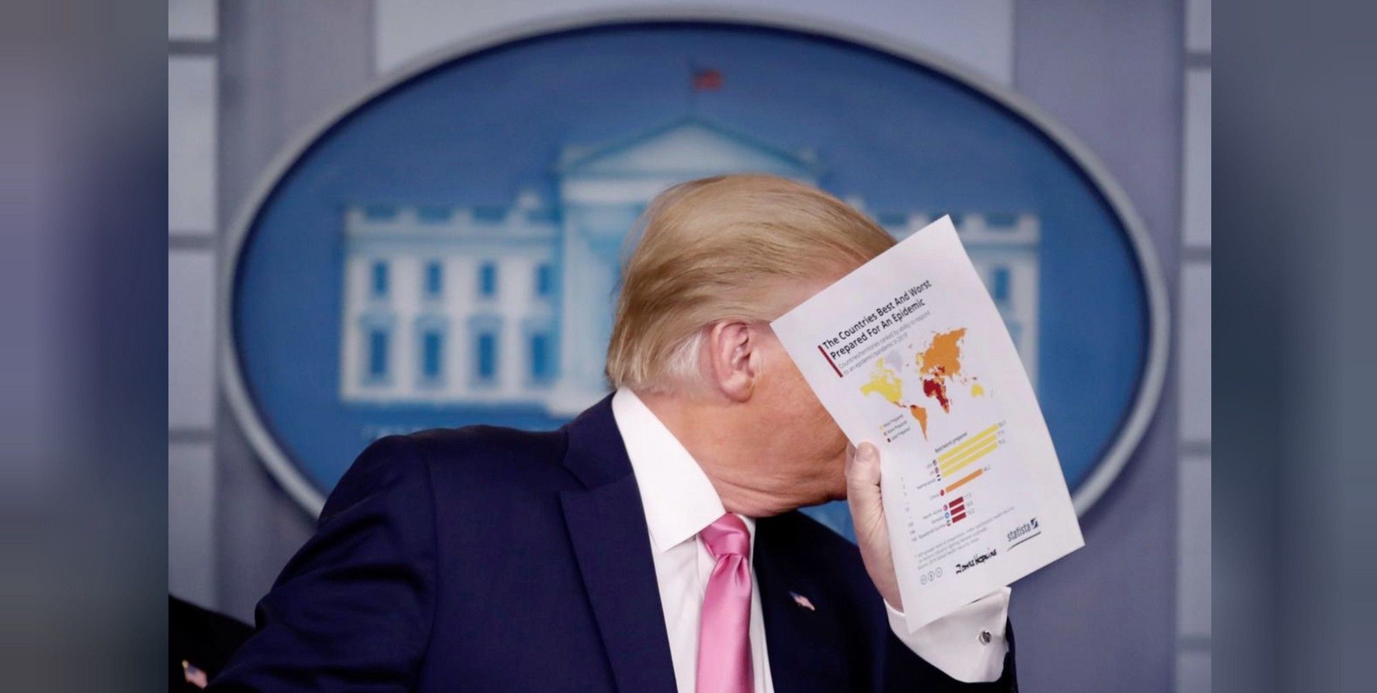
On February 26th, Donald Trump held a printed report in front of his face. He was literally defending himself with paper.
The report was the Global Health Security Index, published in October 2019. The GHS Index was an attempt by the Nuclear Threat Initiative (why?), Johns Hopkins University, and The Economist Intelligence Unit to benchmark pandemic responses across the world.
They had a lot of experts, a lot of data, and the produced an impressive looking report. It was also completely, catastrophically wrong.
Reality has shown that. Their top-ranked countries have performed the absolute worst. The middling ones have done great. Even the bottom has done fine.
These GHS Index actually works best if you hold them upside down. It’s only predictive value is that it’s almost always wrong. Aside from being embarrassing, this has also contributed to disaster. Trump literally used the report to wave away action in February. Action that could have saved hundreds of thousands of lives.
What happened? How did smart people doing their best go so terribly wrong?
What We Have On Our Hands Is A Dead Shark
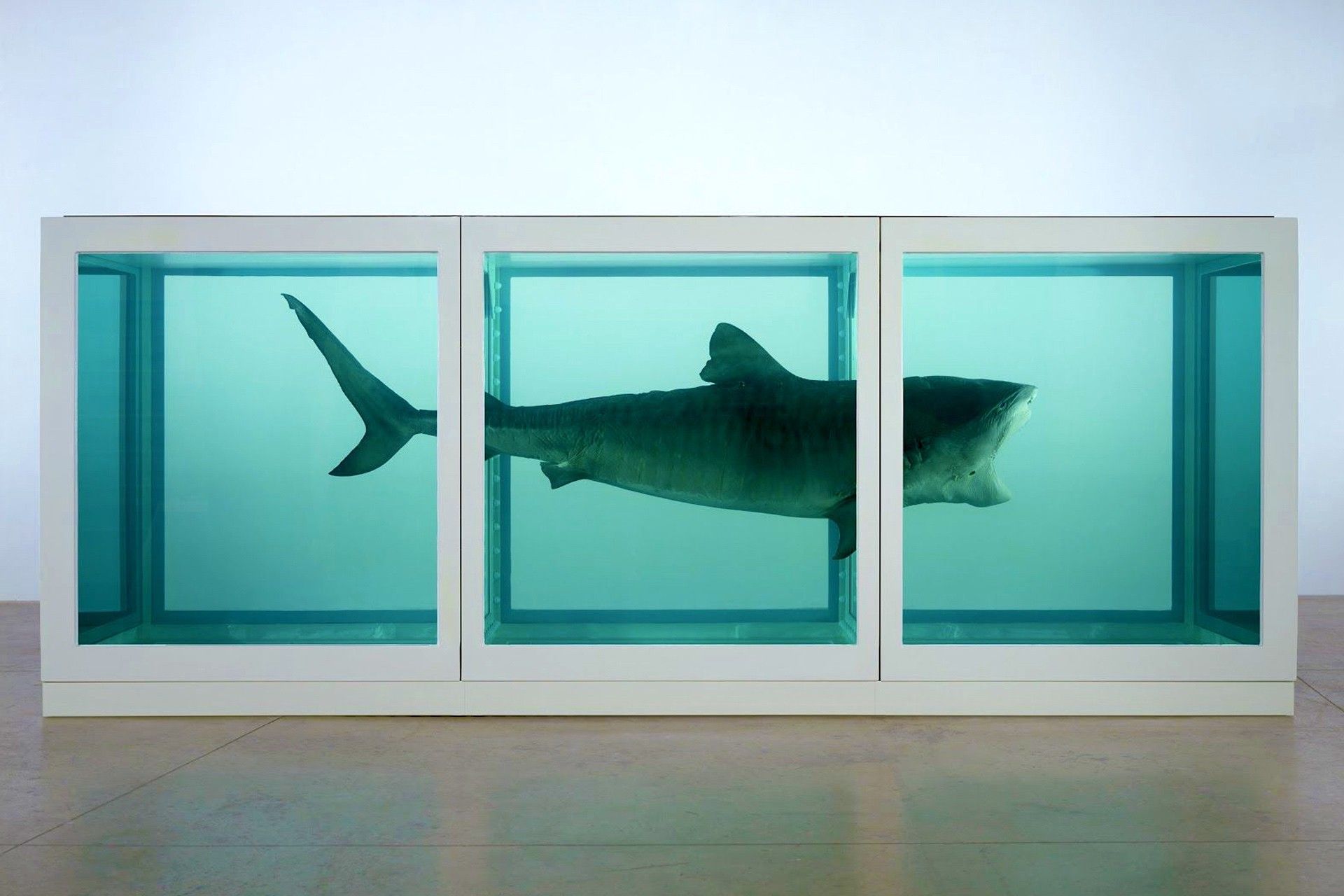
In Annie Hall, Woody Allen is discussing his relationship with Diane Keaton.
“A relationship, I think, is like a shark. You know? It has to constantly move forward or it dies. And I think what we got on our hands is a dead shark.”
You could say the same thing about development.
The world is divided into developing and developed. That’s all, in effect, that this map shows, fancy data gyrations aside. This whole paradigm is false.
Development is like a shark. It has to constantly move forward or it dies. We should actually divide the world into developing and declining, there is no fixed state of ‘development’. There is no reward for standing still. That makes you hugely vulnerable to shock.
Indeed, when a real pandemic hit, that’s exactly what happened. Even the poorest, least ‘developed’ country did something, but western nations just stood still. That complacency is what killed them, not any lack of resources.
And complacency is what this report reinforced.
How It Was Supposed To Happen
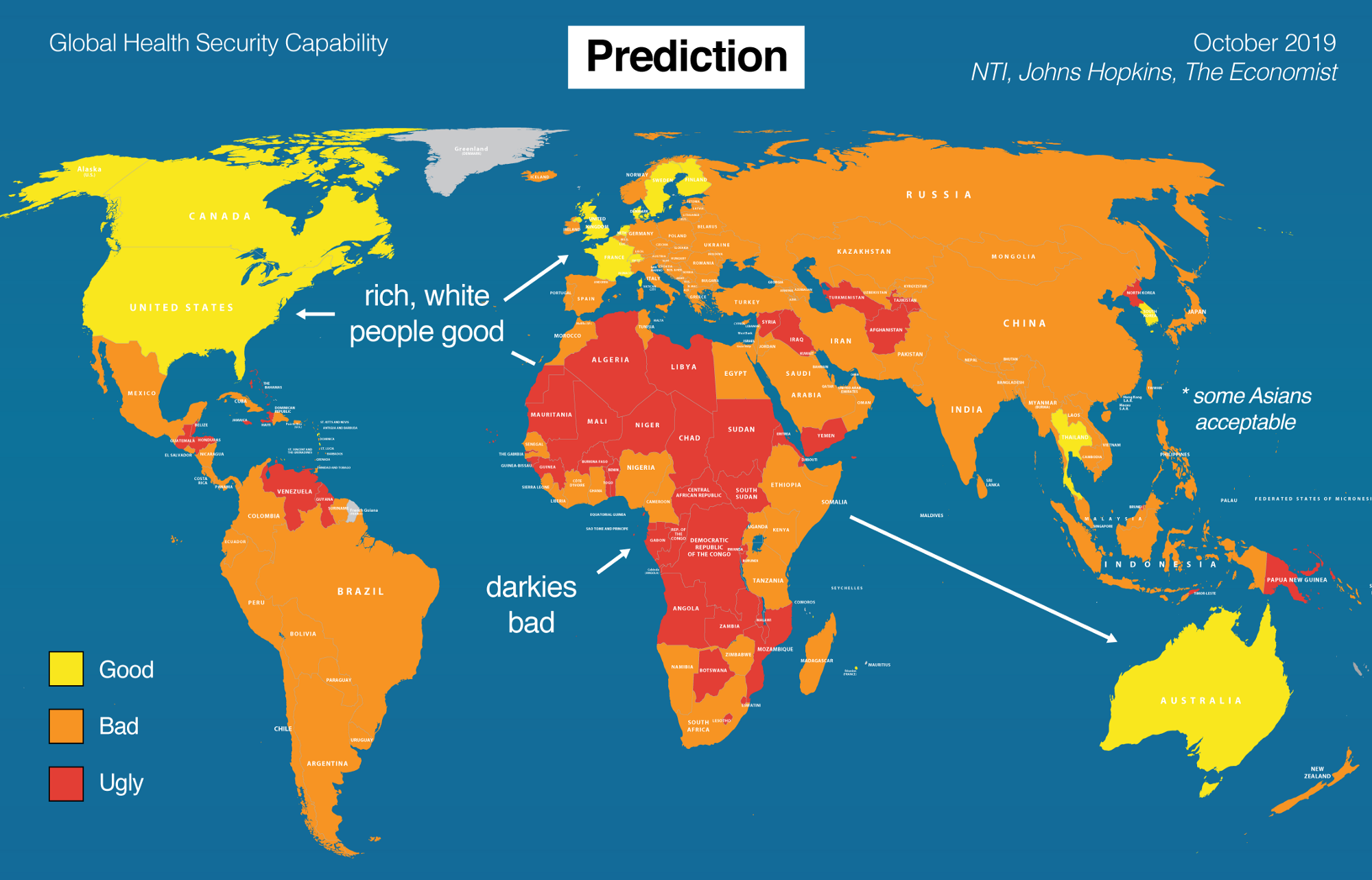
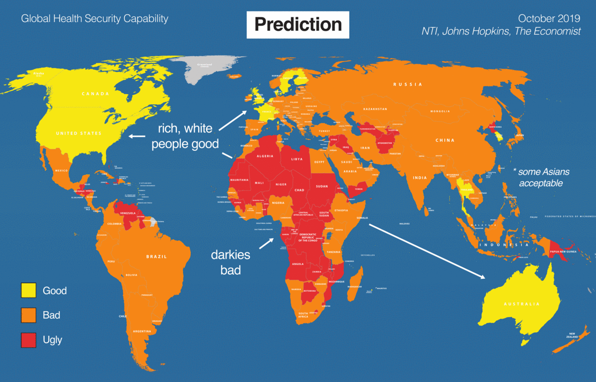
This report might as well have been called The Physical Impossibility of Pandemic in the Mind of Someone Western. The final results are, as mentioned, just a map of the ‘developed’ world vs. the developing, with some gradations around Europe. Even those were completely wrong, they noted the UK, Sweden, and France as the best prepared, while they were the worst.
What they’ve produced is a usual suspects list of western countries and then the usual scary colors around Africa.
If we went by these predictions, the western world should have been relaxed in October 2019, while everyone else should have been worried. And yet this was the complete opposite of observable reality.
Observe.
What Actually Happened
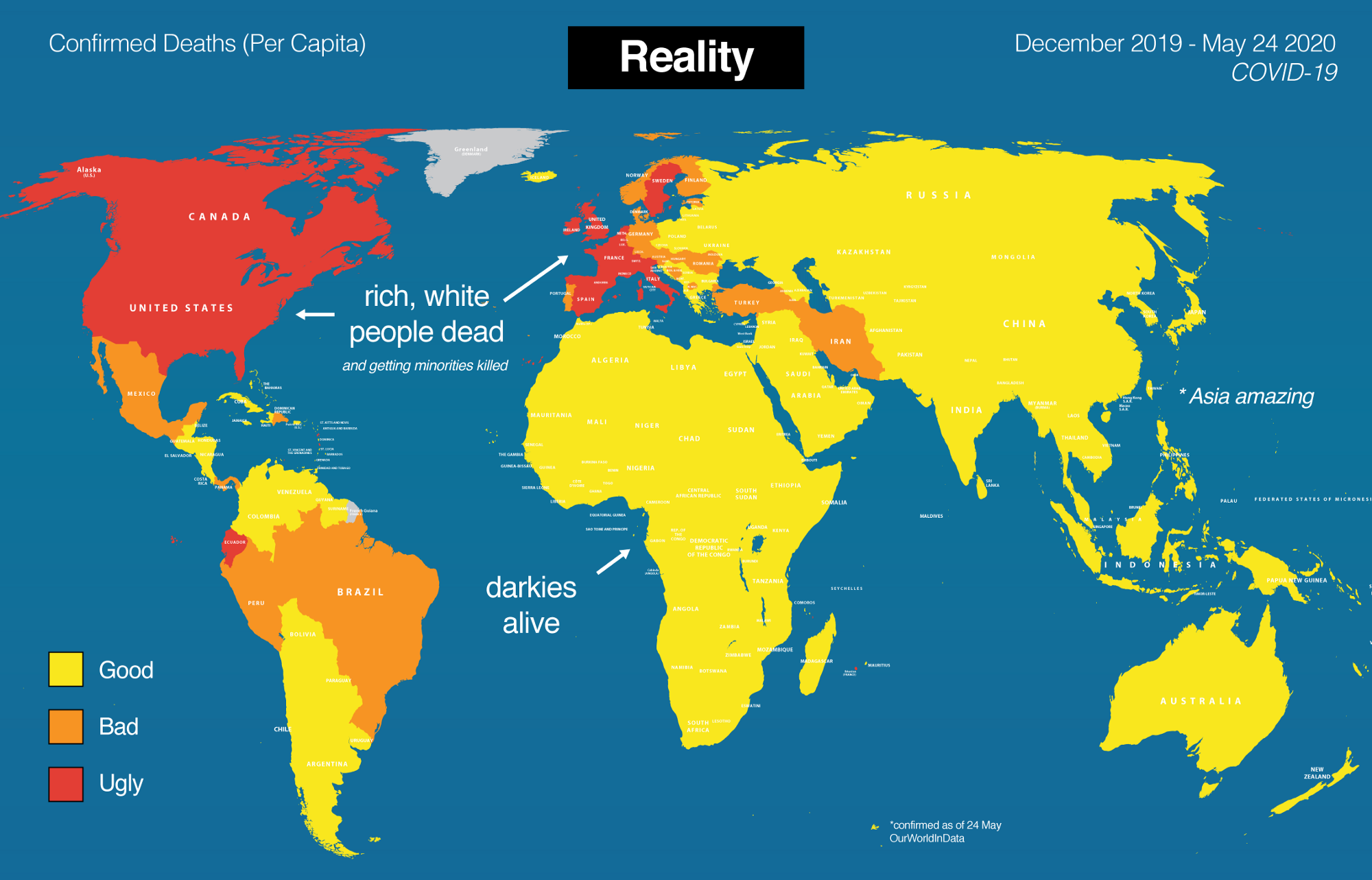
Let’s have a look at what actually happened. Here’s where we are today, mid-pandemic.
So it’s not just that the GHS Index is wrong. In a way they’re right, just on Opposites Day. Pick any country and this Index is almost guaranteed to be wrong.
What they completely missed was the deep competence of Asian nations. Mongolia (46th) probably had the best response in the world, followed by Vietnam (50th). They also completely missed the competence of most of Africa, especially places like Senegal (95th). Again, I could literally pick a country at random and they got it wrong.
Then, of course, they wildly overestimated western capabilities. Of their top 10, a solid 50% have ended up among the worst in the world. This is bad. What killed the west was complacency, and that’s precisely what this report reinforced.
Who Cares?
So who cares? It’s just some numbers on a report. Well, not really.
If this was a dashboard on a plane, it told a bunch of countries that they were 30,000 feet in the air, when in fact they were seconds from the ground. That is a catastrophic error, and if it’s not acknowledged it’s just irresponsible.
Imagine if, instead, that this report had sounded a warning to the US and UK in October? They were still led by idiots but it might have saved a few lives. Instead this report took lives. Trump waved it around and used it to delay action. That has killed over 100,000 people and counting.
For something designed with the best intentions, this is the worst possible result.
What Went Wrong?
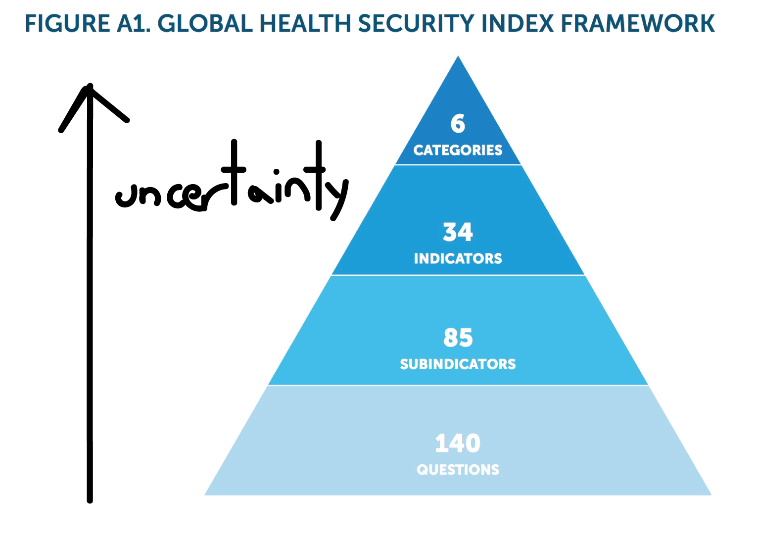
You can download their Excel and look at it. It’s a rat’s nest. They’ve taken 259 (!) indicators, weighted them (11.2% for travel restrictions, OK, why?), and then weighted them again at the category level (19.2% for rapid response, OK, why?). This is complete garbage. It’s just a pyramid of uncertainty.
As you add variables, uncertainty increases. If each variable has 5% uncertainty, then within 100 data points you have nearly 100% uncertainty. The spreadsheet will produce a number, but you should have zero confidence that it answers your question.
The researchers have kept piling on data to look smarter — sourced from government reports, NGO reports, websites, news reports — but each data point has high uncertainty, compounded by the fact that some intern is grading them. The result is, as mentioned, complete garbage. It’s statistical soup.
What makes it worse is that they’ve then weighted everything subjectively, on two levels. They’ve weighted each indicator, and then each category. So they’ve taken a messy statistical soup, strained it twice through even more subjective measures, and published this watery broth as a report.
To be honest, the predictive value of just putting all the country names on a roulette wheel would be higher. Not even God can help you with this spreadsheet.
It’s useless. It’s worse than useless, as results have shown. I don’t even have to critique the methodology. We’ve had an epidemic and this index has been proven wrong. Catastrophically wrong.
Accountability
That’s not even what worries me. Science proceeds by failed experiments, not successful ones. It worries me that they haven’t acknowledged this. The report is still sitting out there, confidently predicting a bizarro future that has already been obliterated by the present. Yet there’s no retraction, no apology, it’s just out there. It may even still be influencing policy. At this point, it’s just irresponsible.
The GHS Index is an epic fail. They need to retract it, apologize, and try to learn from it. Or just put it away. It’s a bad prediction, encased in formaldehyde, stinking and starting to rot.
I think what we have on our hands is a dead shark.